A rise in the use of mobile-first web design
Introduction
Relying on the estimates by CISCO, by 2019, our world will have no less than 8.2 Billion mobile-ready or handheld devices.From 2014 to 2019, the global mobile traffic will increase to tens of times.Even now, there are five times as many mobile devices as there are total personal computers on earth.Not just this, more than 80% of the internet users utilize smartphone for internet access.Let’s face it! Nearly 46% of the mobile users will never return to a website if there is a performance issue.
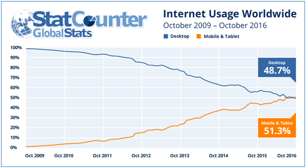
There are hundreds of facts and estimates showcasing the gravity of mobile devices in today’s technological era. Most of us depend heavily on the use of handheld devices. Their significance is only increasing with every second. Thanks to the necessity of technology on-the-go, industries are now focussing on the strategy of “Mobile-first” design. A sharp inclination that caters to mobile design is imperative; however, there is no 180 degree turn from the web design. Yet, the design would specifically and majorly focus on mobile, rather the desktop.
There is always a beginning!
LukeW coined the term “Mobile-First” and the term found its basis backed by the ever-rising mobile web usage. One of the most engaging facts associated with mobile-first was the estimate of data usage by the year 2015. Experts had predicted that annually more than 75 Exabyte or 75 Million Terabytes of data usage shouldn’t surprise us. It is beyond a doubt that down the line, our world would want to realize the notion of mobile-friendly design much more than a desktop design.
A Top-Down Approach should be avoided
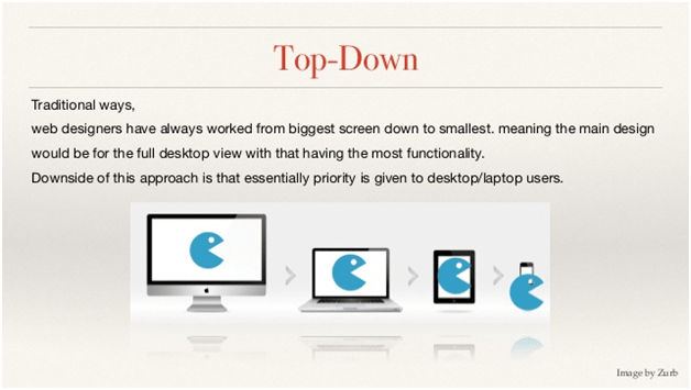
The idea commences from developing the design for bigger screen. The code for smaller screen comes right after. Now, the mobile will get overloaded with code that is absolutely worthless when it comes to the design code for bigger screen. It will only put unnecessary stress on the speed of smaller devices making them excruciatingly slow.
The problem starts to arise when more than 75% of the mobile users expect the site to load within a couple of seconds. Furthermore, they would never return to the website, if it fails to load in the expected time period of five seconds. Not happening!
Do you know that if the design majorly emphasizes on mobile design strategy, there are tens of functionalities that developers would never miss. However, if they rely on top down approach, web design will keep them from adding these capabilities, e.g. GPS, voice input, picture input, phones, and many more. A couple of these capabilities such as those of picture and voice are now prominent in web as well, yet the increasing number of mobile users seems to shadow the fact.
This is quite evident of an utter failure of top down approach.
You can count on Bottom-Up Approach!

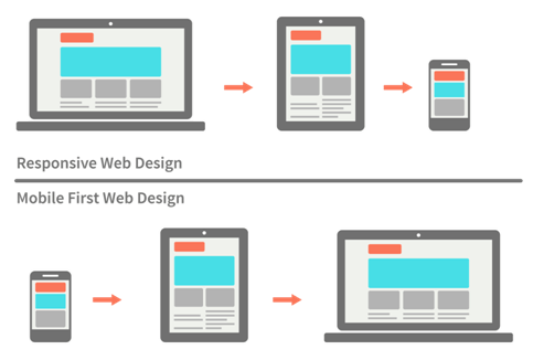
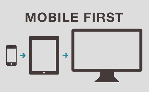
Mobile-First encourages the development of a design that is user-friendly and adapts to various situations. The design will blend in the changes developers can expect in the future. The enhancements will work for all the category of phones, including the lowest-tech phones. The users will have the capability to navigate without any restrictions through site pages. The concept relies on starting with the simplistic approach and adding features eventually that will support higher technology and larger screen.
The bottom-up strategy is impeccable when it comes to design. It encourages usability. As the design is cut short to more than 80% while designing for mobile devices, it is crucial to strategize on how to utilize the screen estate that maximum functionality fits into it. Furthermore, the design should not give the notion of congestion. This implies that the functionality on the phone and the associated design will, no matter what, fall under the core functionality criteria.
Wildnet can help your site cultivate for Mobile-First
The world of Mobile-First is right here! Sites are significantly making advancements as they are relying on this approach. Wildnet developers and designers take immense pride in declaring their expertise in Mobile-first and its related benefits. After exploring the beautiful and very many capabilities of mobile first, you can, undoubtedly notice the difference in the end results. For more information and capabilities of Mobile-First, write to us!
Need help ! Contact Us

Too many Thanks for Website Designer info
I extremely suggest this agency for website needs.
Amazing, marvelous weblog layout! Precisely how very long are you how to become a freelance web developer currently posting for? you have made blogging and site-building glimpse quick. Your entire view of this site is exceptional, in addition to the information!